
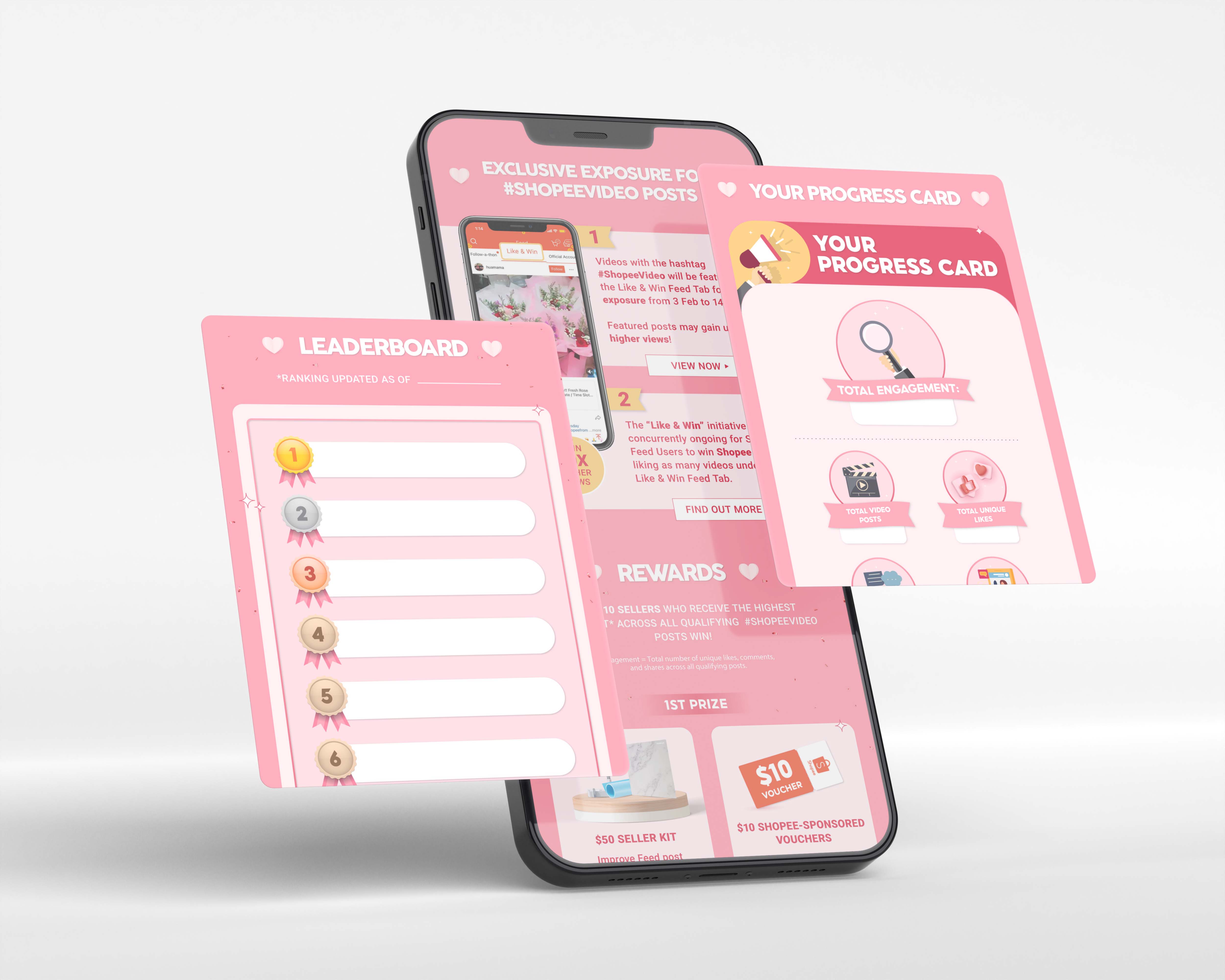
I was tasked with designing a microsite that not only attracted the intended audience but also presented the information in a clear and straightforward way. The design followed Shopee’s Valentine’s Day theme and branding, keeping the look festive while making sure the user experience stayed simple and easy to follow.
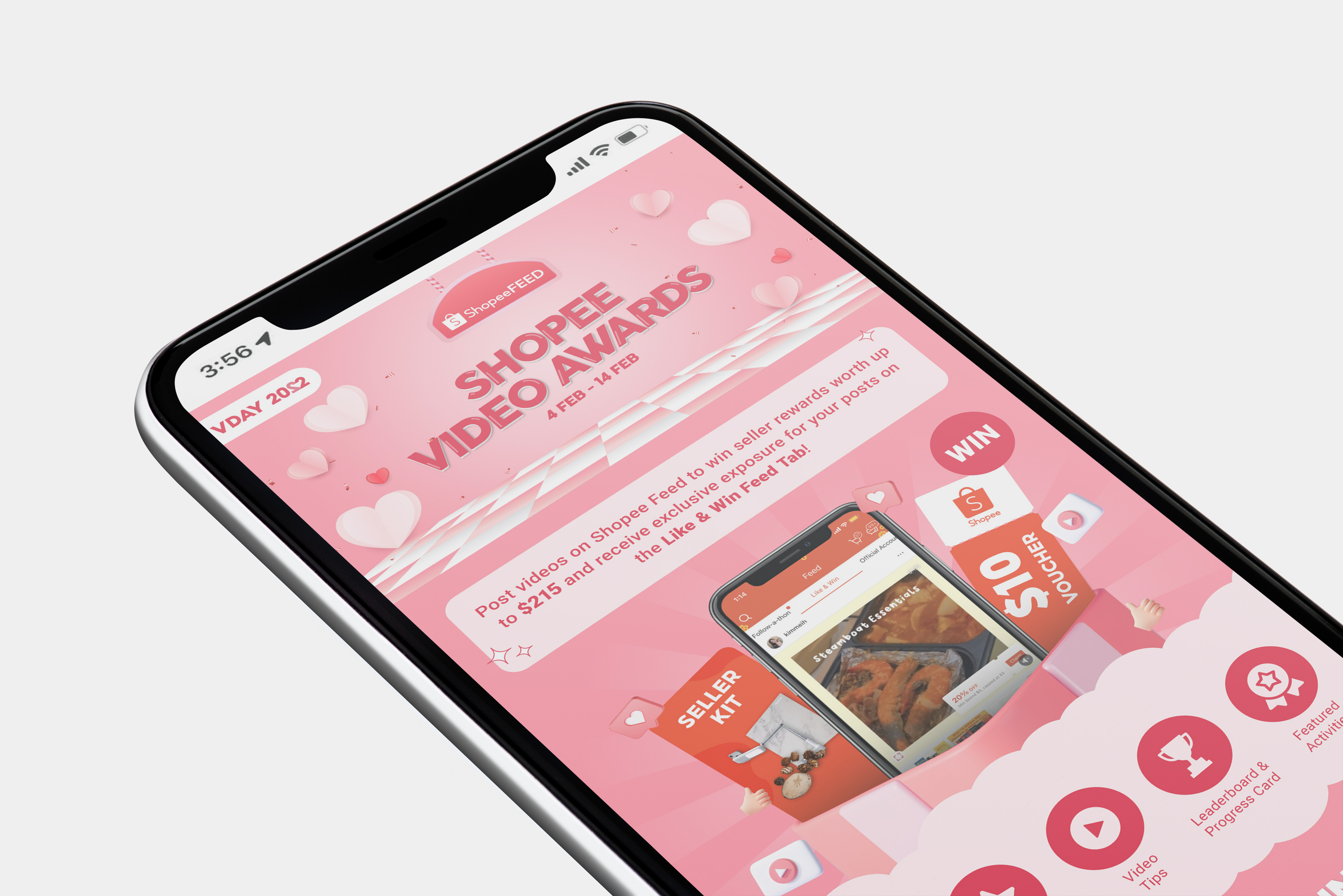
During the design process, I experimented with different layout variations to find a balance between clarity and engagement. I paid close attention to visual hierarchy, testing how information could be presented in a way that felt intuitive while still reflecting Shopee’s branding. To strengthen the festive identity, I incorporated a color palette and graphic elements that tied back to the Valentine’s Day theme and complemented the microsite’s title.
.jpg)