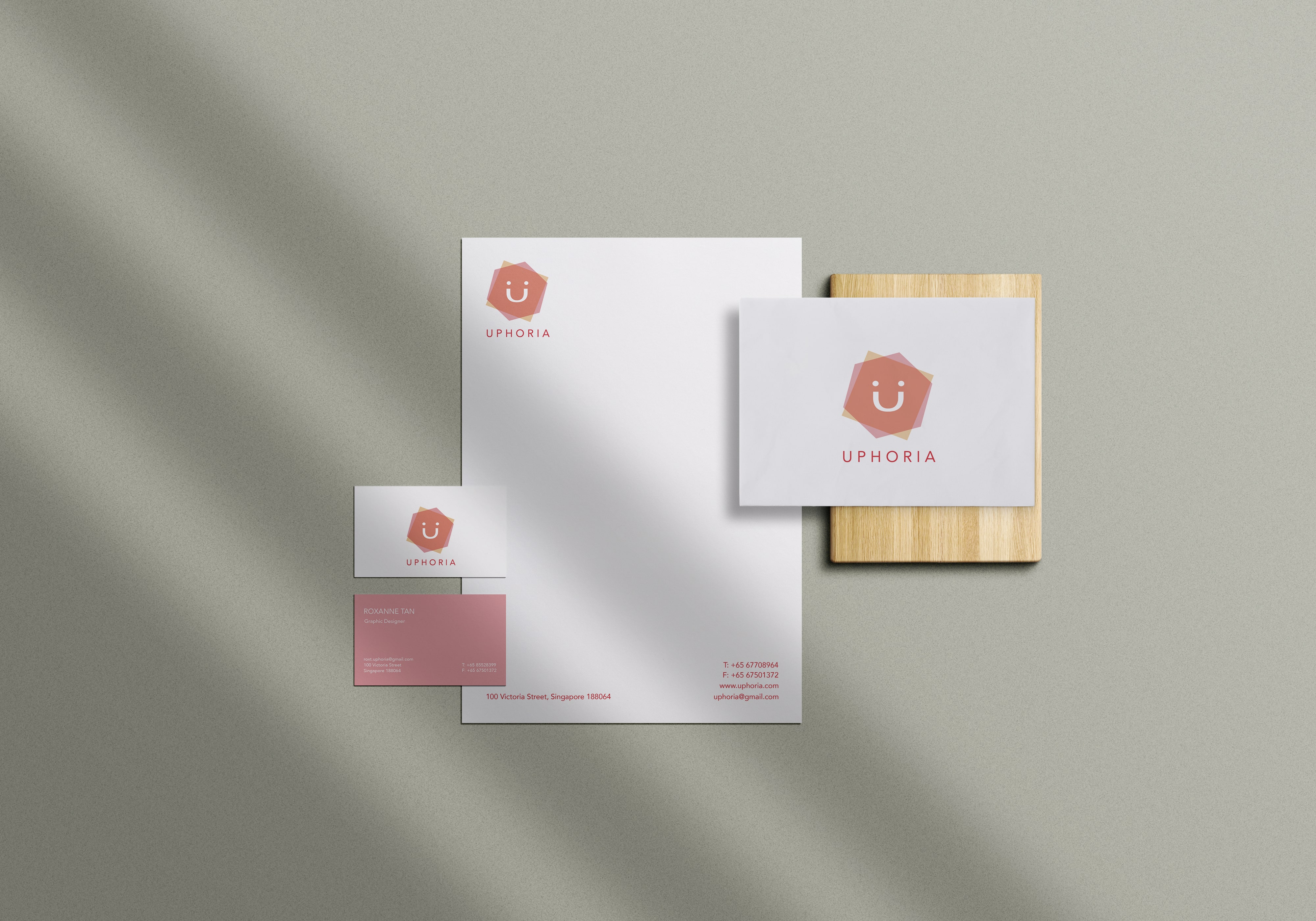
The company name is derived from the word Euphoria, which means ‘a feeling of intense excitement and happiness.’ To reflect this, I incorporated a smiley face into the logo design. I chose to drop the ‘E’ in Euphoria to highlight the focus on you, the customers, leading to the name Uphoria. The ‘U’ in the logo is further integrated into the smile, reinforcing the idea of joy and positivity at the heart of the brand.

I used duotone colors for the brand and incorporated simple shapes into the logo design. The original palette of light blue and pink was later changed to yellow and pink to better capture the vibrant, energetic spirit that Uphoria represents. The name itself is derived from euphoria, a state of happiness and self-confidence, which reflects the core values Uphoria aims to embody.

.jpg)
.jpg)
.jpg)
.jpg)


